Benchmarking the Ann Arbor Region
How Do We Compare?
The goal of this report is to take the pulse of Ann Arbor region in comparison to a specific competitive set of technology-driven communities and their economies.

Start Exploring

* Please use Chrome, Firefox and/or Edge for best site experience. Internet Explorer, Safari can have issues rendering some aspects of the charts below

A city, its county, and its competition


Who are we competing against?


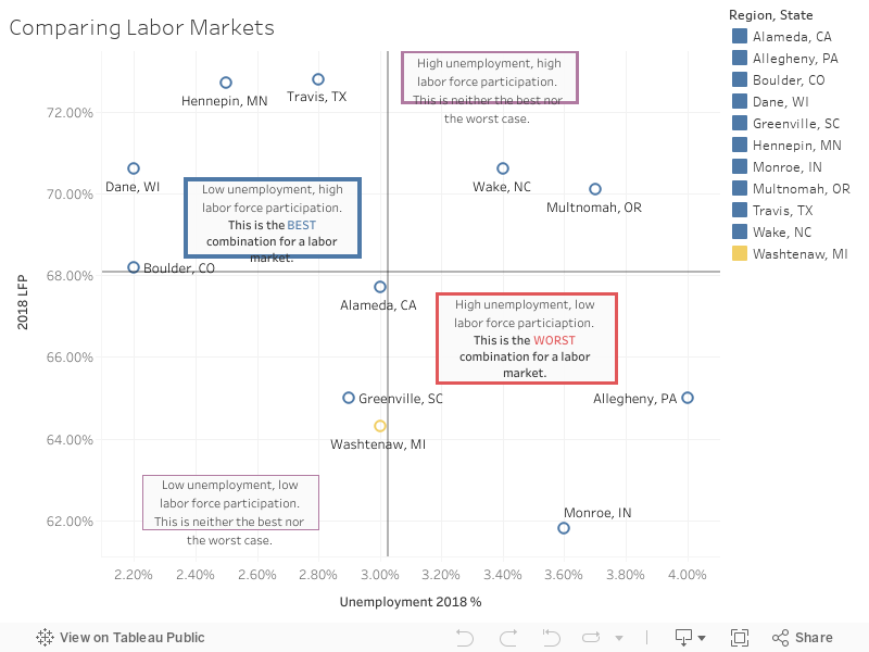
Thank you for considering Ann Arbor, Michigan as a potential location for your business. Although Ann Arbor is a small college town in the midwest, we often find ourselves competing with much larger cities along with other college towns around the United States. Austin is a perfect example: we get lumped together when talking about large schools (UT and UM) but it’s important to remember that Austin is eight times larger than Ann Arbor. For that reason, the data have been normalized for population where possible.

This study is not meant to be marketing material; we produce plenty of that already It’s meant to take a deep dive into a few crucial metrics that can help distinguish one competitor from another.

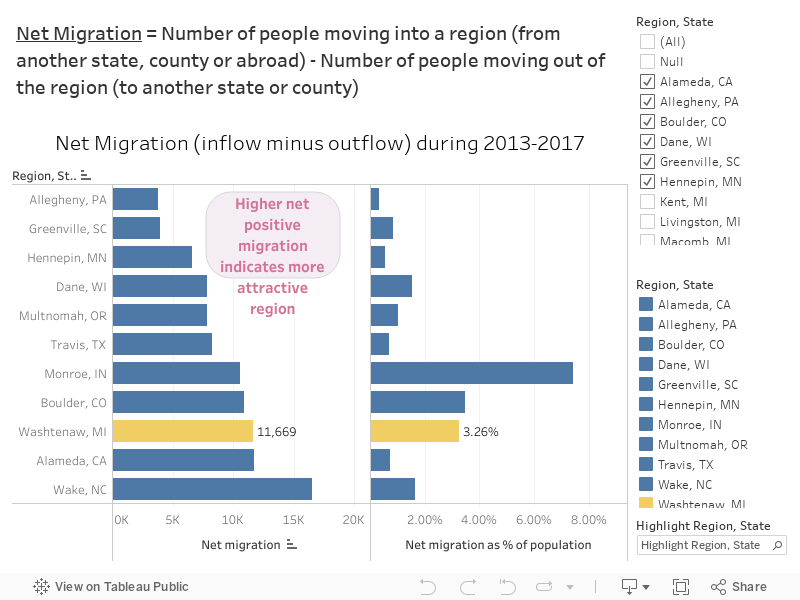
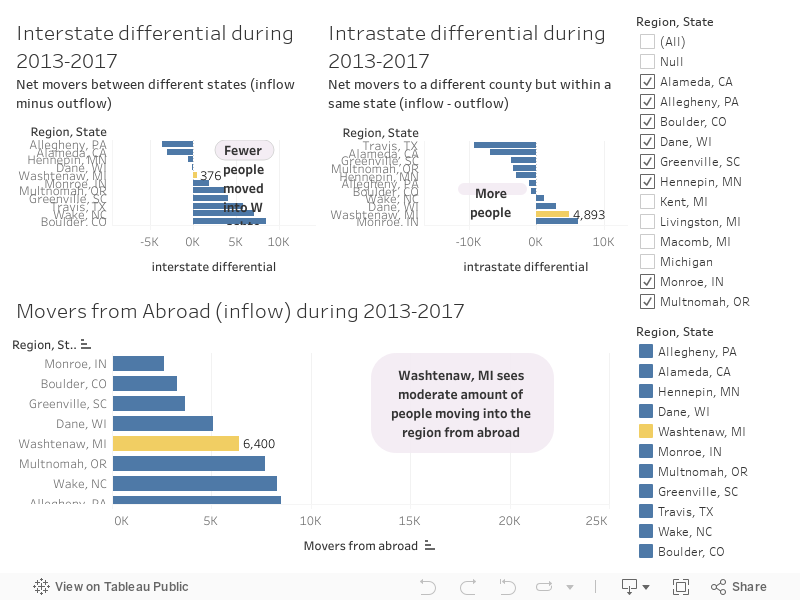
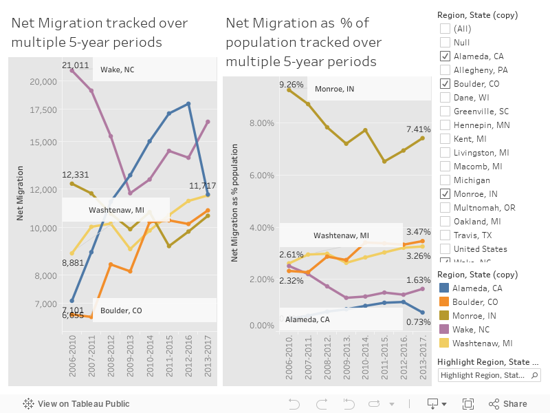
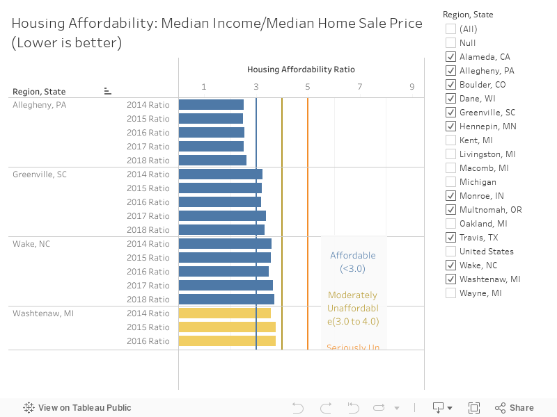
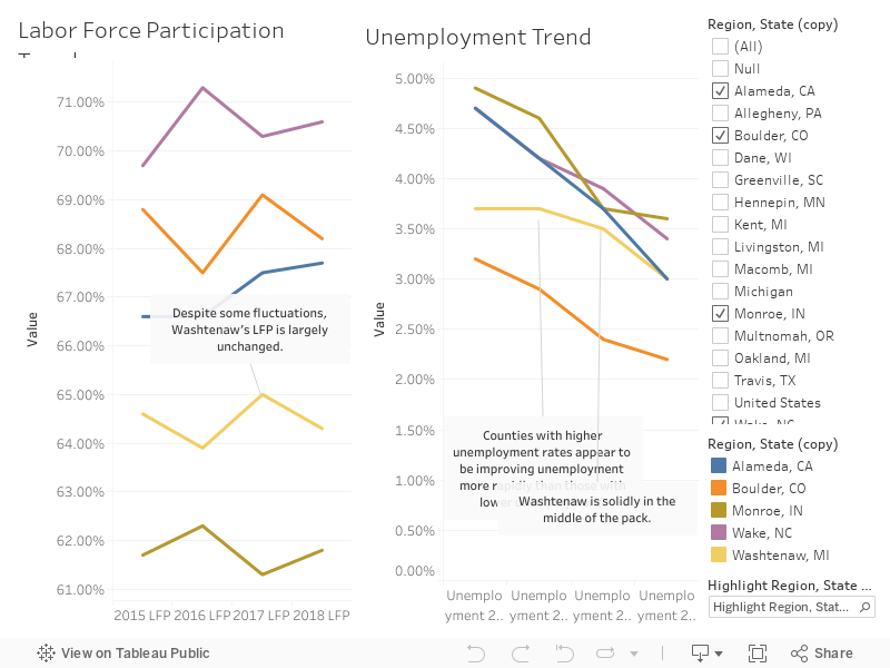
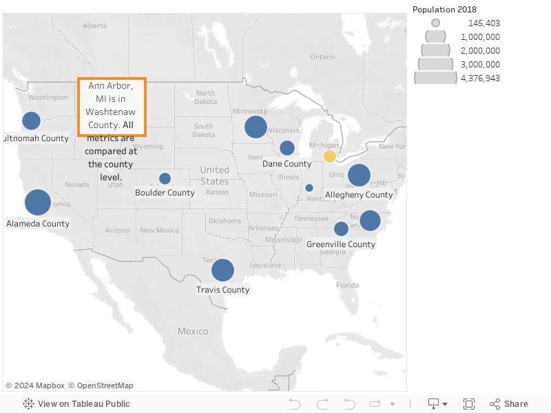
Note: all metrics are compared at the county level. Ann Arbor, MI is in Washtenaw county.


Where you headed? A look at population movement


Population is growing due to migration. Talent finds the region attractive.


What it is:

These are period estimates that measure where people lived when surveyed (current residence) and where they lived one year prior. The data are collected continously over a five-year period. The flow estimates resemble the annual number of movers between counties for a five-year period.

Source of data: US Census Flows Mapper

Why it matters:

To be considered an important hub, the Ann Arbor region must be attractive to outside talent. Net population movement, both inter as well as intrastate, can potentially indicate the attractiveness of a region to outside talent, especially when viewed as proportional to the population.


NEXT CHART > Deep-dive of population movement

Where are people moving? A deep dive into population movement


Most of the people moving in are either coming from abroad or within Michigan.


Interstate: These are people moving from one state and/or county to another state. The differential tracks the net movement i.e. people moving into one state minus the people moving out
Intrastate: These are people moving within the same state but to a different county. The differential tracks the net movement i.e. people moving into one county from another within the same state
Abroad: These are people moving into a state/county from abroad

Net Migration: Interstate differential + Intrastate differential + Movers from Abroad

Over the past few years, all roads lead to...


Our population is growing more than most of our competitors.


In terms of net migration, Washtenaw county (Ann Arbor region) sees a higher net inflow proportional to its population that most competitor regions.


Driving industry (no, not like Uber)


There is a diverse industry cluster present in all of the competitive set. The Ann Arbor region is in the bottom third of the pack, but performs much higher than the US as a whole, signifying a robust supply chain, plenty of customers, and a more resilient economy.


What it is:

The percentage of the total employed population of a region employed in driving industries


Why it matters:

Economies grow and prosper by their ability to make products and deliver services to people and businesses outside their geographic regions i.e. by exporting. Driving industry jobs create and support jobs in other local industries, and propel economic growth.


A place to (affordably) lay your head


Housing affordability is always relative to your starting point. Coming from the coasts, your salaries will be extremely competitive, and your employees will be able to afford homes.


What it is:

This ratio measures affordability by dividing the median home price by the median income


Why it matters:

Housing cost is a key factor influencing quality of life, which affects a region's ability to attract and retain talent. Housing affordability is also a measure of inequality and access to opportunity; if the ratio is high, it can indicate a higly segregated real estate market, and a high level of income inequality. Conversely, it is also an indicator of attractiveness of a housing market.


Working hard, or hardly working?


Pre-pandemic, the Ann Arbor region’s labor market wasn’t as tight as some of our competing technology hubs. There is a robust talent pool here.


What it is:

The national unemployment rate reflects the number of unemployed people as a percentage of labor force. The labor force participation rate (LFP for short) measures the number of people in the labor force as a percentage of civilian non-institutionalized population 16 years old and over. In other words, it is the percentage of the population either working or actively seeking work.


Why it matters:

A low unemployment rate and high labor force participation rate are signs of a well-oiled, competitive labor market. In 2018, Ann Arbor had low unemployment but also low labor force participation compared to its peers, which makes Ann Arbor an interesting place for new jobs or policy solutions.


Labor markets, changing like any other market


Over time, the Ann Arbor region’s unemployment has steady improved while LFP has remained unchanged despite fluctuations.


While the previous visualization showed a snapshot of 2018, we can see the trends over the past few years for each labor metric below.

In conclusion, the Ann Arbor region punches above its weight on many metrics, comfortably competing with regions ten times its size. The talent pool is growing and is more accessible than some of the more recognizable technology hubs. Plus, employees can afford to put down roots. There is a diverse industry cluster that supports and shields the local economy from larger shocks; you may only think of us as a college town but we are so much more.


MORE INFO > About US

ABOUT US

This visualization was created in the summer 2020 term for UC Berkeley Data Science course: w209 Data Visualization.
All of the code for this visualization can be found in the Github Repository.
You can find additional information around the intended users, tasks, and data for each visualization in the repository's README.

Alex

Alex West

LinkedIn

Avinash

Avinash Chandrasekaran

LinkedIn

Bethany

Bethany Keller

LinkedIn

John

John Boudreaux

LinkedIn